
Yúmiko
Wear The Statement.
The Story
Yúmiko is a contemporary jewelry brand built around self-expression, confidence and statement-making style.
The challenge wasn't simply to create a logo. Yúmiko needed a visual identity that could capture the energy of bold jewelry while still feeling intentional, distinctive and elevated a brand that could stand out in a crowded fashion and jewelry space without losing its sense of refinement.
Ellion Creative approached the project by looking beyond the logo and considering how Yúmiko should look, feel and be experienced across every customer touchpoint.
The result is a visual identity built to make a statement.
The Challenge
Creating a brand with personality without losing polish.
Jewelry branding can easily fall into familiar visual territory: delicate typography, muted palettes and predictable expressions of luxury.
Yúmiko called for something different.
The brand needed to communicate boldness and individuality, while still giving customers the perception of quality and intentionality expected from a premium jewelry experience.
The challenge was finding the balance between expression and restraint creating a brand that could be loud without becoming chaotic, and distinctive without becoming difficult to use.
The Creative Direction
Bold by nature. Intentional by design.
The chosen creative direction established a visual language around organic forms, strong contrast and confident colour.
Rather than building Yúmiko around traditional jewelry conventions, we leaned into a more contemporary fashion perspective.
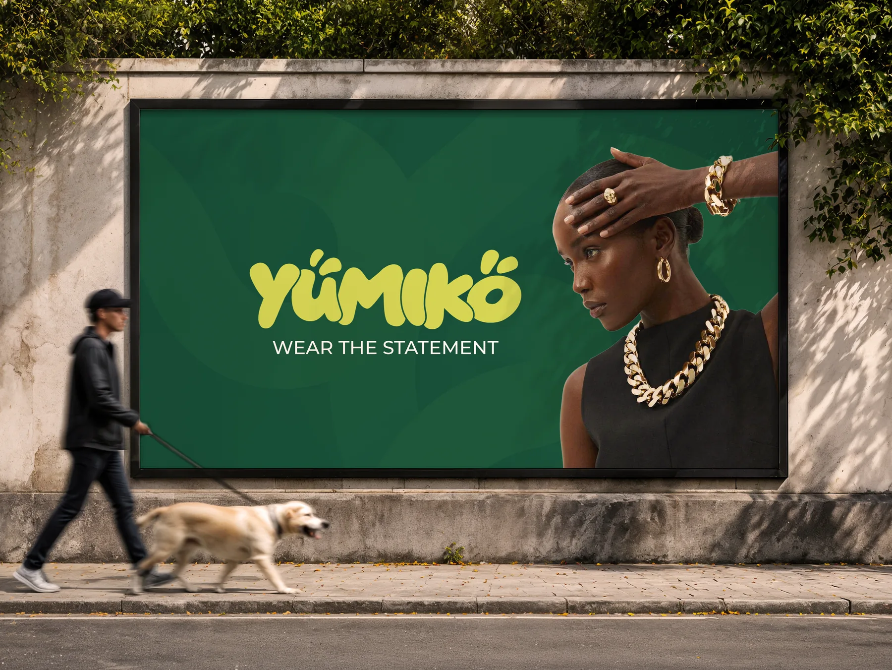
The deep green provides the foundation. The vibrant lime introduces energy and recognition. The expressive wordmark gives the brand its personality.
Together, these elements create an identity that feels confident, youthful, expressive and unmistakably Yúmiko.
The Identity
A wordmark with movement and personality.
The Yúmiko wordmark was developed to feel fluid and expressive rather than rigid or overly formal.
Its organic forms give the name a distinctive rhythm, allowing the identity to feel at home across packaging, digital platforms and physical brand applications.
The tagline Wear The Statement reinforces the role of the jewelry itself: not simply something to wear, but something through which the customer can express themselves
The Visual System
Recognition through contrast.
The colour system pairs:
Deep Green — #00523BThe grounding tone of the identity.
Yúmiko Lime — #D1DC4FThe energetic accent that creates visual recognition and gives the brand its distinctive character.
The combination creates a system that can shift between bold and refined depending on the application from a jewelry box to a social media post.
The Outcome
A visual identity designed to be remembered.
Yúmiko now has a distinctive visual foundation that can grow across jewelry, packaging, social media, retail environments and future digital experiences.
The identity gives the brand a recognizable visual language while leaving enough flexibility for new products, campaigns and experiences to evolve within the system.
The goal wasn't to make Yúmiko look like every other premium jewelry brand.
It was to give Yúmiko its own presence.
Bold enough to be noticed.Distinctive enough to be remembered. Flexible enough to grow.
