
Saacid Distribution
A brand built to move with the market.
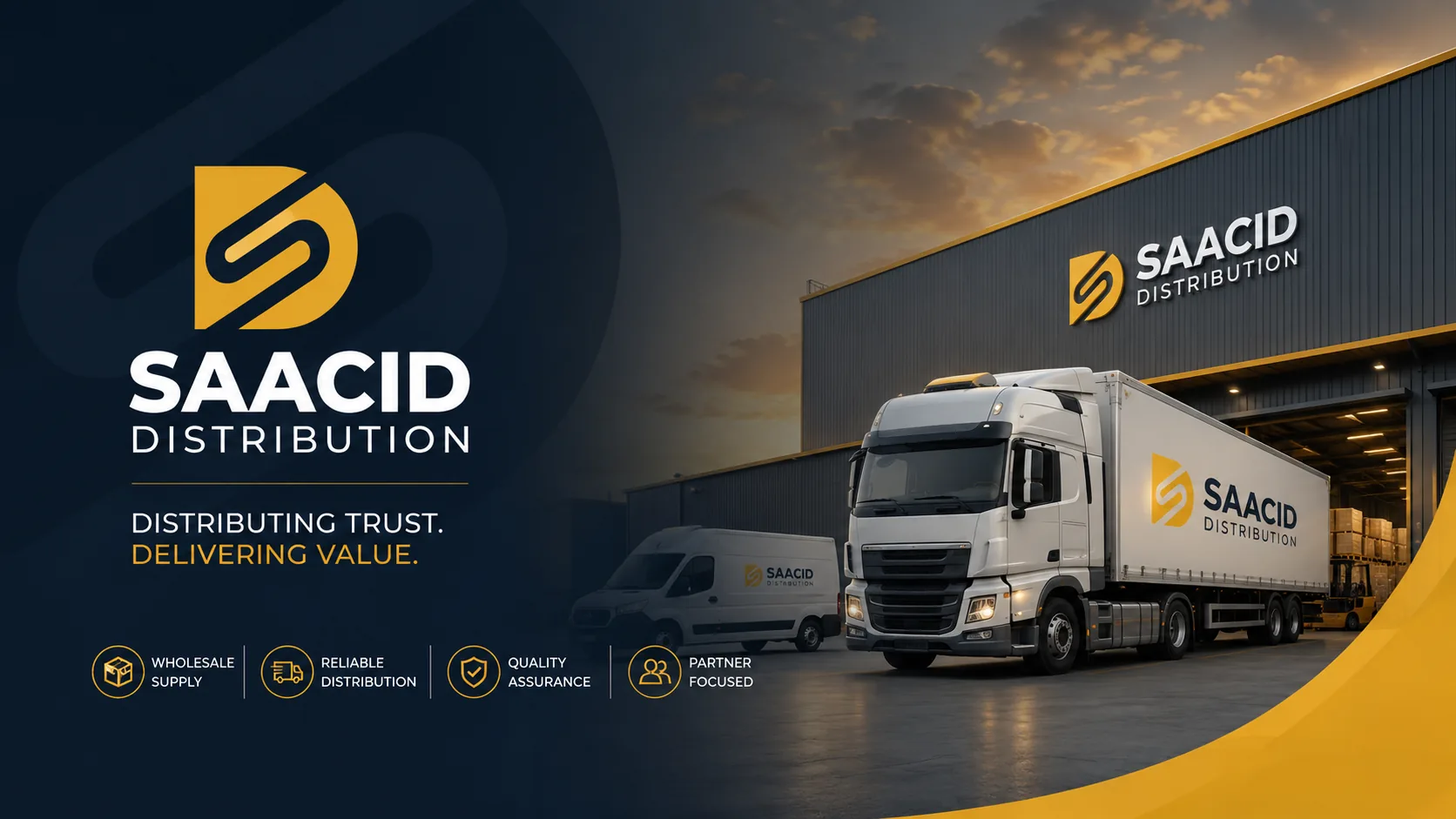
The Story
Saacid Distribution was established in 2017 and has operated across different product categories over the years from flour, yeast and bakery products to building materials, and more recently, baby diapers.
But there was an important challenge:
How do you build a brand identity for a company whose products can change with the market?
The answer wasn't to design around one product.
Instead, Ellion Creative focused on the business behind the products distribution, movement, adaptability and scale.
The result was an identity designed to remain relevant as Saacid continues to evolve.
The Challenge
Saacid needed an identity that could represent the company as a general trading and distribution business, rather than making it appear tied to one particular product category.
The identity needed to work across:
- Different product categories
- Packaging and product environments
- Distribution vehicles
- Business documents
- Digital platforms
- Future markets and opportunities
The brand also needed to communicate the maturity of a company established in 2017 while giving it a more contemporary and professional visual presence.
The Approach
We started by looking beyond what Saacid distributes today and focused on what Saacid does at its core.
The visual direction was built around four principles:
Reliability
A distribution business depends on trust. The identity needed to feel dependable and established.
Movement
Distribution is ultimately about connecting products with markets. The visual language needed a sense of direction and flow.
Adaptability
Saacid's product categories can change according to market demand. The identity therefore had to remain product-neutral.
Scale
The brand needed to feel equally appropriate on a business document, a social media profile, a delivery vehicle or a large distribution environment.
The Logo
The core of the identity is an abstract SD monogram.
Rather than using literal symbols such as trucks, boxes, warehouses or specific products, the mark combines the initials of Saacid Distribution into a simple geometric form.
The structure creates a sense of movement, direction and continuity, while remaining distinctive enough to function independently as an icon.
This gives Saacid a mark that can continue to represent the business even as its product portfolio changes.
Product-neutral by design.
That was intentional.
The Colour Direction
The final visual direction combines deep navy and gold.
Deep Navy
Represents stability, trust and professionalism.
Gold
Introduces energy, value and a sense of ambition while giving the identity a distinctive premium character.
Together, the palette creates a balance between corporate credibility and visual presence.
The system was also designed to work in monochrome, ensuring the identity remains practical across different production environments.
The Result
The final identity gives Saacid Distribution a clearer and more unified visual presence — one that isn't restricted by what the company distributes today.
Instead, it provides a foundation for where the company can go next.
From bakery products to building materials to baby-care products, the identity remains relevant because it represents Saacid the distributor, rather than Saacid the product.
