
Sanura
Product rebrand & packaging design
The Challenge
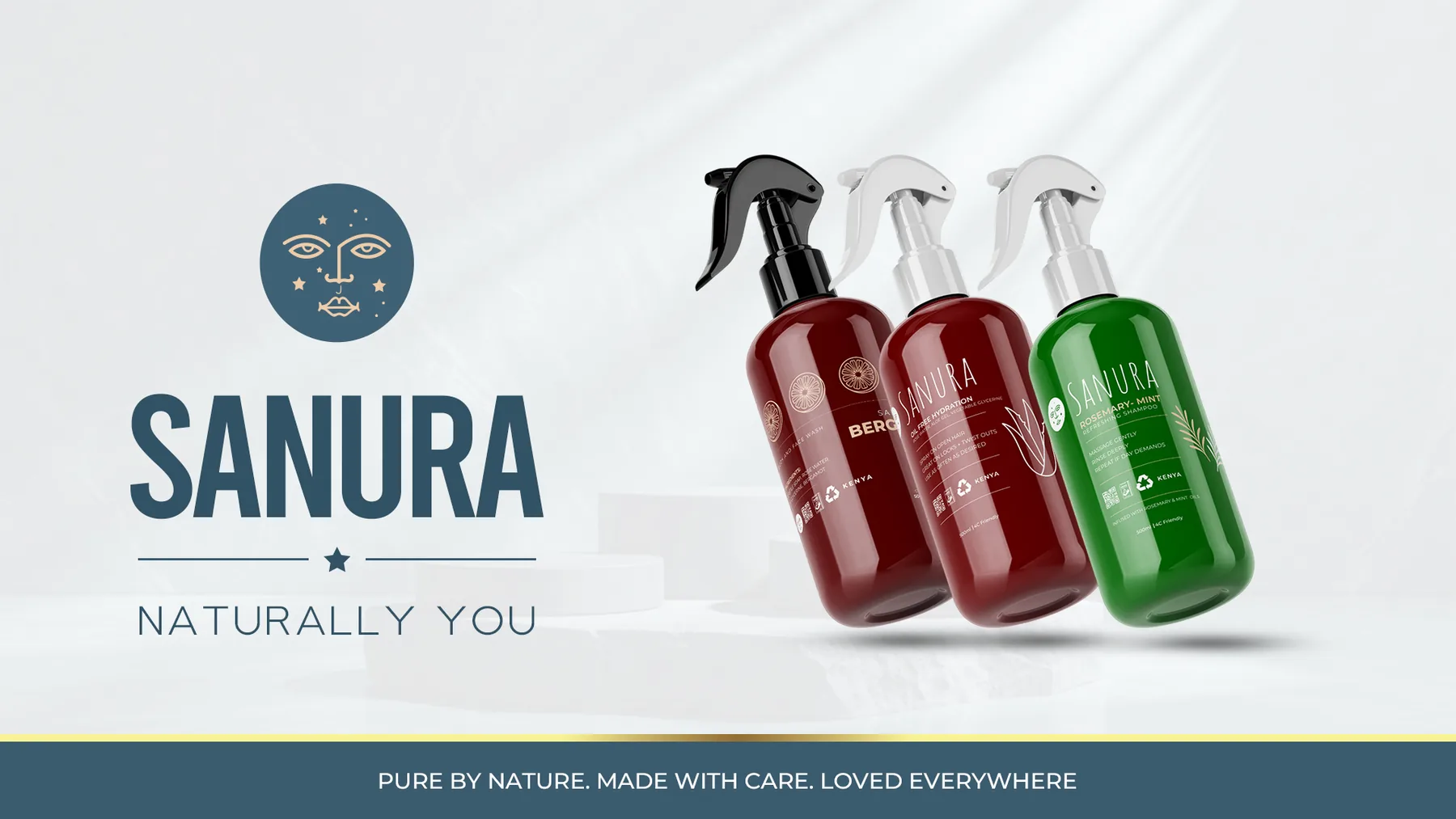
SANURA came to Ellion Creative with a range of personal-care products that needed a more refined and consistent visual direction.
The goal wasn't simply to redesign the labels. The products needed to feel more premium, intentional and trustworthy while remaining practical for physical production.
For the Rosemary & Mint Shampoo, in particular, the packaging needed to work with direct silk-screen printing on an amber-brown bottle, meaning the design had to balance aesthetics with real production limitations.
The Thinking
We approached the project from the perspective of how the product would ultimately be experienced on the bottle, on the shelf and in the customer's hands.
Rather than relying on a heavily detailed label, we developed a cleaner visual language built around:
- Strong brand hierarchy
- Botanical-inspired elements
- Premium typography
- A restrained colour palette
- Clear product information
- Artwork optimized for silk-screen printing
The amber-brown bottle became part of the visual identity rather than something to hide.
For the Rosemary & Mint product, botanical artwork helped communicate the natural character of the formula while the typography and spacing created a more sophisticated presence.
The Solution
Ellion Creative developed a refreshed packaging direction for SANURA with a focus on premium simplicity.
The artwork was prepared specifically for silk-screen production, with the design translated into clean vector artwork and carefully considered print colours.
We created the packaging artwork alongside realistic product mockups, allowing the client to visualize the finished product before production.
The final delivery included:
Packaging DesignPremium front-facing product artwork designed around the physical bottle.
Silk-Screen ArtworkVector-based, production-ready artwork prepared for direct printing.
Product MockupsRealistic visualizations showing how the redesigned packaging would appear on the finished products.
Print-Ready FilesOrganized production files supplied in appropriate formats for implementation.
The Outcome
The redesigned SANURA products moved from concept to physical products in the market, bringing the new visual direction to life.
The final packaging gives SANURA a more cohesive and premium presence while maintaining the natural character of its hair-care range.
Most importantly, the work demonstrates how thoughtful branding isn't limited to what looks good on screen it has to survive production and still look good in the real world.
The design work required a minimalist output. The team at Ellion understood the assignment on using illustrations that are simple but evoke meaning to the consumer. Would recommend especially for cosmetic packaging design, rendering and final mockup delivery.
