
Rytan Prestige
Packaging design & brand consistency
The Story
As a dairy brand expands its product range, every product needs to communicate the same level of quality, recognition, and trust. From yoghurt flavours to different packaging sizes and traditional dairy products, consistency becomes an important part of how customers recognise the brand.
Rytan Prestige presented an opportunity to refine its packaging and create a more cohesive visual presentation across its growing range of dairy products.
The Challenge
The project involved working with existing packaging designs while addressing sizing inconsistencies, adjusting typography, and adapting layouts to suit different product formats.
With multiple yoghurt flavours, different packaging sizes, Mala, and Natural Yoghurt joining the product range, the challenge was to maintain a recognisable brand identity while ensuring each product had a clear and appropriate presentation.
The goal was not simply to change labels, but to make the packaging work together as one cohesive product family.
Our Thinking
At Ellion Creative, we approached the project with three priorities: consistency, clarity, and practicality.
Each label needed to preserve the Rytan Prestige identity while giving individual products enough distinction to be recognised. We considered the relationship between flavour names, product imagery, typography, nutritional information, and technical packaging details.
We also focused on the practical side of packaging design. Accurate dimensions, readable text, and properly arranged product information are essential when preparing artwork for printing.
The Solution
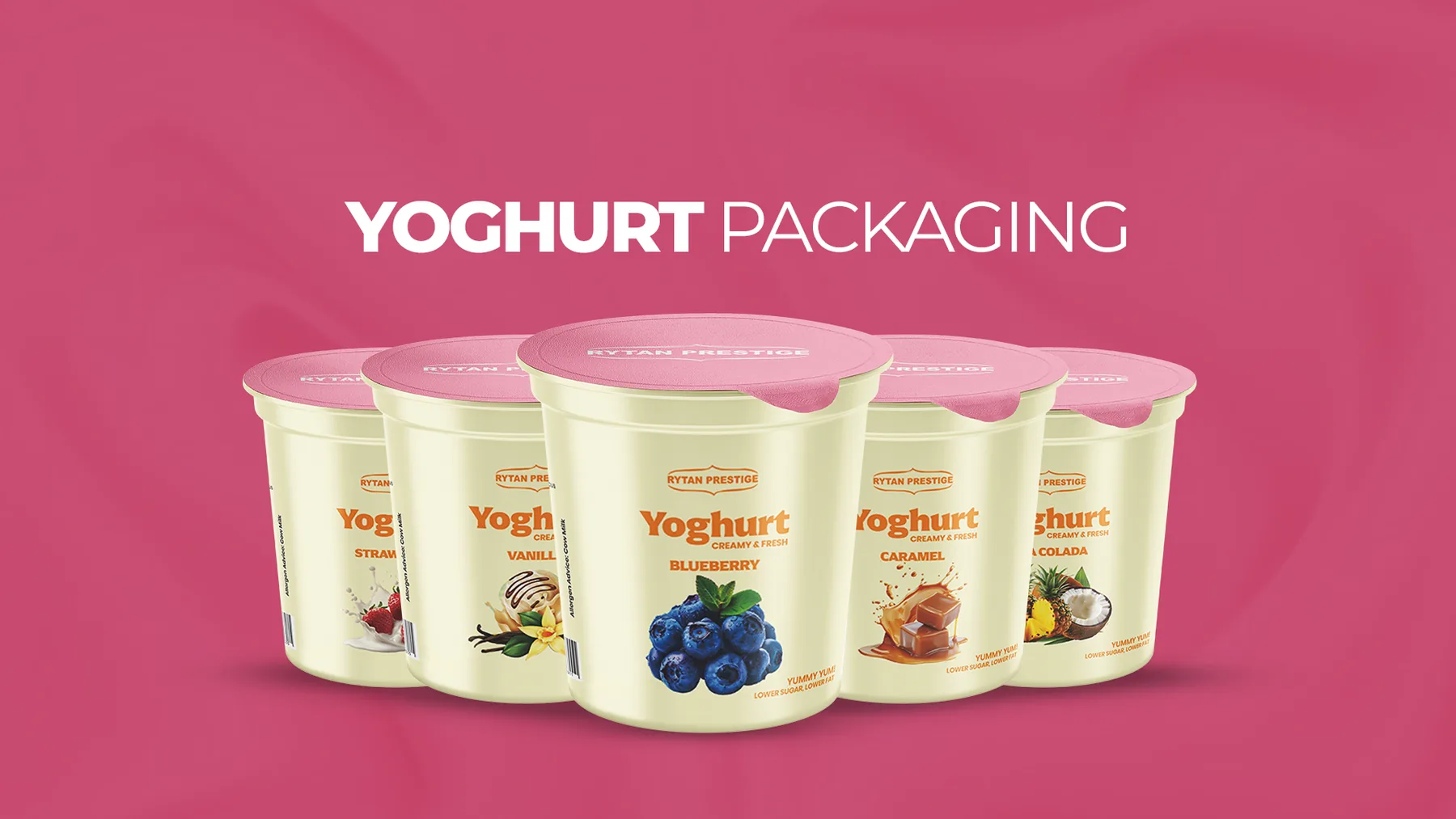
We refined and adapted the packaging designs across the yoghurt range, including Vanilla, Strawberry, Blueberry, Caramel, and Pina Colada, while extending the visual system to Mala and Natural Yoghurt.
The work included correcting label dimensions, adjusting text sizes and layout proportions, maintaining consistency across packaging formats, and preparing artwork for production.
We also explored supporting promotional materials to help present the products more clearly to customers.
Rather than treating every label as a separate design, we approached the range as a connected visual system, with each product contributing to the overall identity of Rytan Prestige.
The Outcome
The project established a more consistent visual presentation across Rytan Prestige's expanding dairy range, bringing the different products under a unified packaging direction.
By refining the layouts and adapting the designs to their respective formats, the work focused on making the labels clearer, more cohesive, and better prepared for production.
The result is a packaging system designed to support product recognition while giving the brand a consistent foundation as its range continues to grow.
The Ellion Creative Approach
Good packaging does more than identify what's inside a container. It helps customers recognize a brand, understand a product, and build familiarity over time.
At Ellion Creative, we bring design thinking and practical production considerations together to help brands present their products with greater consistency and purpose.
Working with Ellion Creative has been a great experience - he is attentive, detail-oriented, time-conscious and truly has a knack for bringing ideas to life. His creativity and commitment to quality really stand out.
