
Fahari Yoghurt
Reimagining a familiar dairy brand through a modern, flavour-led visual system.
The Story
What if Fahari could feel as good as it tastes?
Fahari Yoghurt already had the foundations of a recognizable dairy brand. The opportunity was to explore what could happen when that familiarity was paired with a stronger, more intentional visual system.
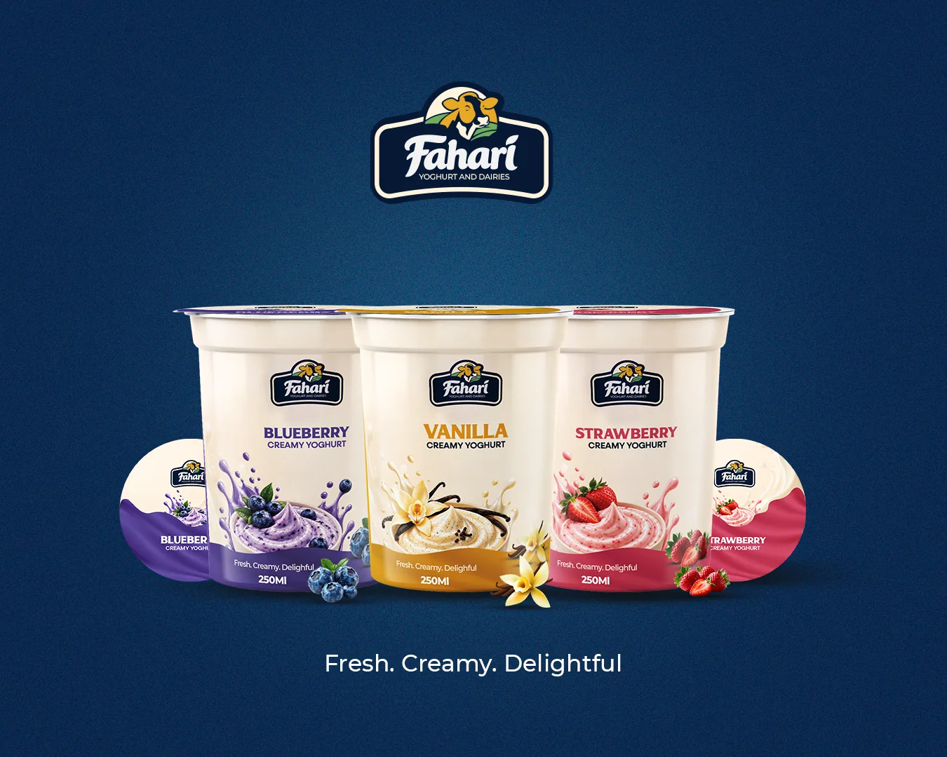
For this conceptual project, Ellion Creative reimagined Fahari across three flavours — Strawberry, Blueberry and Vanilla — creating a packaging direction designed to feel cohesive, appetizing and ready to live beyond the shelf.
The idea wasn't to make Fahari look like a completely different brand.
It was to bring out a stronger version of what was already there.
The Challenge
Three flavours. One recognizable brand.
A multi-flavour FMCG range needs to do two things at once:
Build recognition for the master brand while allowing each flavour to have its own personality.
The challenge was therefore not simply creating attractive labels.
It was creating a visual system where a consumer could see Strawberry, Blueberry or Vanilla and immediately understand that they belong to the same family.
The packaging needed to establish a clearer hierarchy between:
Brand → Flavour → Product → Supporting information
while leaving enough room for each flavour to express itself.
The Creative Direction
Familiar at heart. Fresh in expression.
The visual direction was built around three core ideas:
1. A strong brand anchor
Fahari's navy became the foundation of the identity, providing consistency across the range.
2. A warm dairy world
A soft cream base creates a natural connection to yoghurt while giving the packaging a warmer, more premium canvas.
3. Flavour-led colour
Rather than giving every SKU an entirely different look, each flavour receives its own accent colour within the same system.
This creates differentiation without sacrificing brand recognition.
The Flavour System
Three flavours. One visual language.
The packaging architecture remains consistent across the range while the flavour expression changes.
Strawberry
A refined strawberry pink brings energy and appetite appeal to the range while keeping the overall look sophisticated.
Blueberry
A rich blue-violet accent gives Blueberry its own identity while avoiding the overly grape-like appearance that can sometimes happen with purple packaging.
Vanilla
Warm gold and creamy neutrals create a softer, indulgent expression that naturally connects with vanilla's visual cues.
Together, the three flavours create a recognizable Fahari family.
The Packaging
Designed as a system, not three individual labels.
The front of pack was intentionally simplified.
The hierarchy leads the eye through:
- FAHARI
- FLAVOUR
- CREAMY YOGHURT
- HERO FLAVOUR VISUAL
- SIGNATURE FOOTER
- 250 ML
This gives the consumer the information they need quickly while allowing the product itself to remain the hero.
A flowing footer treatment was introduced as a recurring visual element, giving the packaging a subtle sense of movement and reinforcing the creamy nature of the product.
Strawberry
Bright. Familiar. Delicious.
Strawberry establishes the more energetic side of the range.
The flavour colour, fresh strawberries and creamy yoghurt work together to create an immediately recognizable flavour story without overwhelming the Fahari identity.
The result: a Strawberry SKU that feels vibrant while still belonging unmistakably to Fahari.
Blueberry
Deep. Distinctive. Contemporary.
Blueberry introduces a richer visual tone to the range.
The blue-violet palette gives the flavour enough personality to stand apart while the cream and navy keep it connected to the master brand.
The result is a flavour treatment that feels distinctive without breaking the system.
Vanilla
Warm. Creamy. Familiar.
Vanilla became the most indulgent expression of the system.
Gold accents, vanilla flowers, vanilla pods and creamy yoghurt textures work together to communicate the flavour visually before the consumer even reads the descriptor.
The same packaging architecture remains intact, proving that the system can change personality without losing consistency.
Beyond the Cup
A brand shouldn't stop working when the packaging ends.
Once the packaging system was established, we explored how the new visual language could extend into advertising.
The Vanilla direction was translated into large-format outdoor advertising, using the product, flavour imagery, creamy textures and typography at a much larger scale.
The same identity that works on a 250 ML yoghurt cup now has enough visual strength to work on a billboard.
Bringing the Brand to Life
From product to experience.
The visual direction was also explored through lifestyle art direction.
Rather than presenting Fahari only as a packaged product, the campaign world places it within moments of enjoyment and connection.
This gives the identity room to exist across:
- Packaging.
- Outdoor.
- Digital.
- Social media.
- Lifestyle campaigns.
The brand becomes more than something sitting on a shelf.
It becomes something people can see themselves experiencing.
The Outcome
One brand. Three flavours. One cohesive world.
The conceptual redesign creates a scalable visual system for Strawberry, Blueberry and Vanilla, giving each flavour its own character while maintaining a clear Fahari identity.
More importantly, the project demonstrates how packaging can become the starting point for a much larger brand world.
From a yoghurt cup...
to a billboard.
From a product shot...
to a lifestyle campaign.
Every application speaks the same visual language.
The Ellion Perspective
We don't just redesign packaging.
We look at what happens after the packaging is designed.
Can the system scale?
Can another flavour be introduced?
Does the product remain recognizable from a distance?
Can the same visual language work on social media?
Can it become an advertising campaign?
Can consumers recognize the brand before they even read the flavour?
That's the thinking behind the work.
For Fahari, the answer became a visual system designed to make the brand feel more cohesive, more expressive and more ready for the world beyond the shelf.
