
Joi Products
Hair-care packaging & art direction
The Challenge
Joi Products came to Ellion Creative with a range of hair-care products that needed a stronger and more cohesive visual presentation.
The goal wasn't simply to put information on a label. The packaging needed to communicate the purpose of each product, create stronger shelf presence, and give the range a more polished and professional identity.
The Thinking
We approached the project from the perspective of how the products would actually be seen by customers.
Each product needed its own personality while still feeling like part of the same Joi family.
We explored color, typography, product benefits, imagery and layout to create a visual system that could work across different products and packaging sizes.
For the clear gel products, we used the transparency of the product as part of the visual direction rather than fighting against it.
The Solution
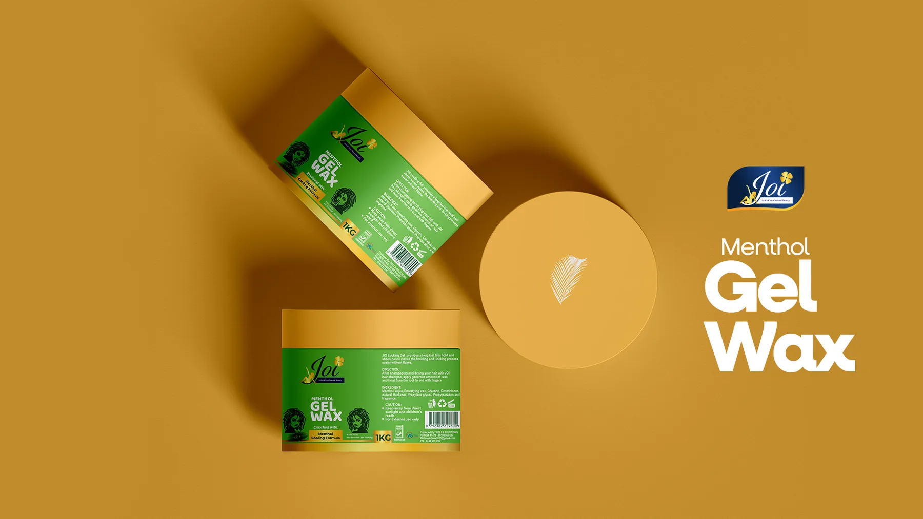
Ellion Creative developed packaging designs for three Joi hair-care products, including Braiding Gel, Styling Gel and Menthol, creating distinct visual treatments while maintaining consistency across the range.
The designs incorporated:
- Clear product hierarchy and stronger product naming
- Benefit-led messaging
- Product-specific visual elements
- Consistent Joi branding
- Carefully selected color palettes
Clean information layouts for ingredients, directions and manufacturer details
- Print-ready packaging artwork
- Packaging mockups to visualize the finished products
Alongside the packaging, we also produced campaign visuals to give the products a professional visual presence that could be used across marketing and promotional materials.
The Outcome
The final direction brought the Joi products together as a more recognizable and cohesive product range, while allowing each product to communicate its specific purpose.
From the physical packaging to the campaign imagery, every touchpoint was designed to make the products feel cleaner, more intentional and ready for the market.
We worked with Ellion Creative on our product marketing designs and product labels and we couldn't be happier. Ellion's design work is exactly what we needed modern, sleek, and premium. He elevated our entire product range with consistent, eye-catching visuals that truly stand out on the shelf and online. Highly recommended.
